Visual Identity & Packaging
Inspired by the radiant glow of fluorescent hues. Fluoresuds was founded in hopes of adding a touch of vibrancy to your daily skincare routine. Each soap bar is handcrafted with simplicity and quality in mind for both your skin and the environment, using only natural ingredients and eco-friendly packaging. From smooth oatmeal, to fragrant lavender, each of their scents are absolutely irresistible.

The concept for Fluoresuds’ visual identity and packaging is deeply rooted in the brand’s ethos of combining vibrancy with natural simplicity. The challenge was to craft a visual identity that balances the lively, eye-catching aesthetics suggested by the brand name with the purity and handcrafted essence of their natural soaps.
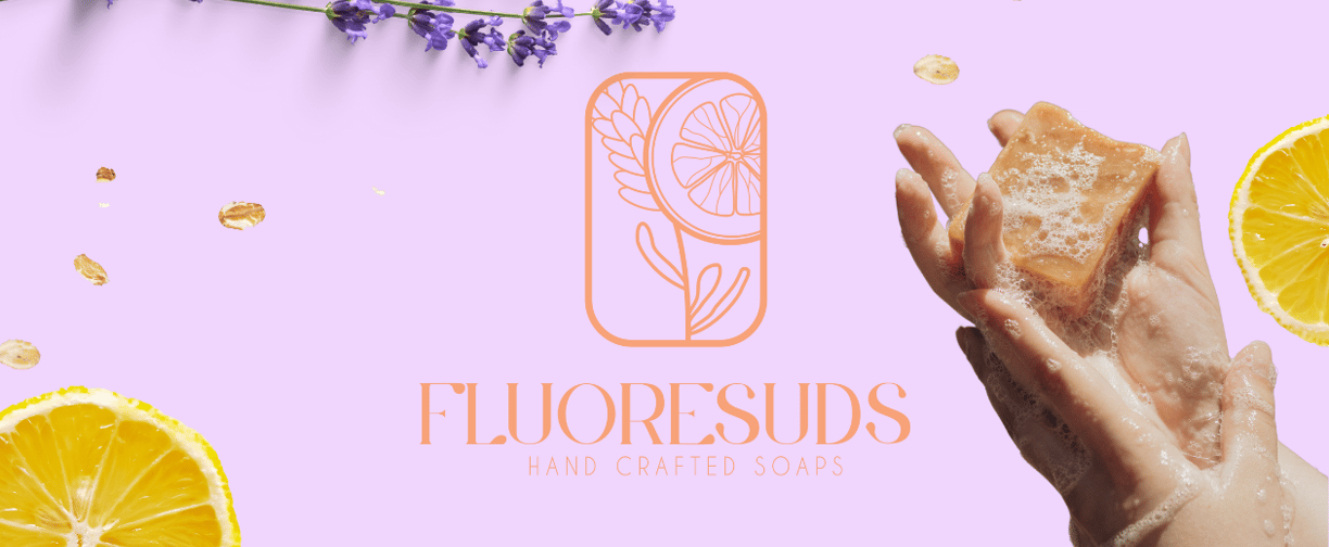
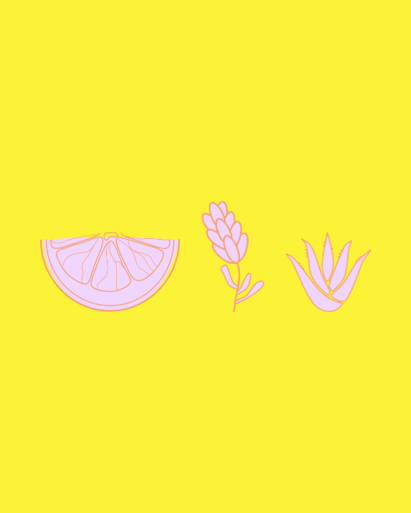
Our color selection process was meticulous and intentional. We chose a palette that captures the vibrant spirit of fluorescence, featuring bright, energetic hues that evoke the radiance of a fresh, glowing complexion. At the same time, we ensured these colors felt organic and natural, reflecting the simple, pure ingredients of our soap. The result is a harmonious blend of vibrancy and subtlety, embodying the dual nature of Fluoresuds.
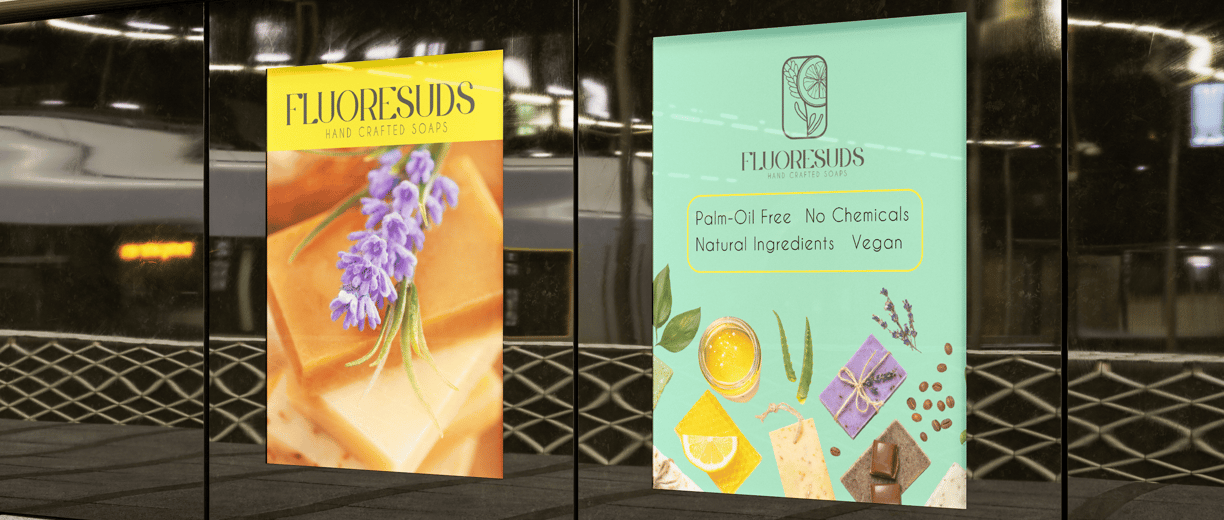
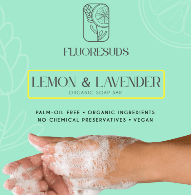
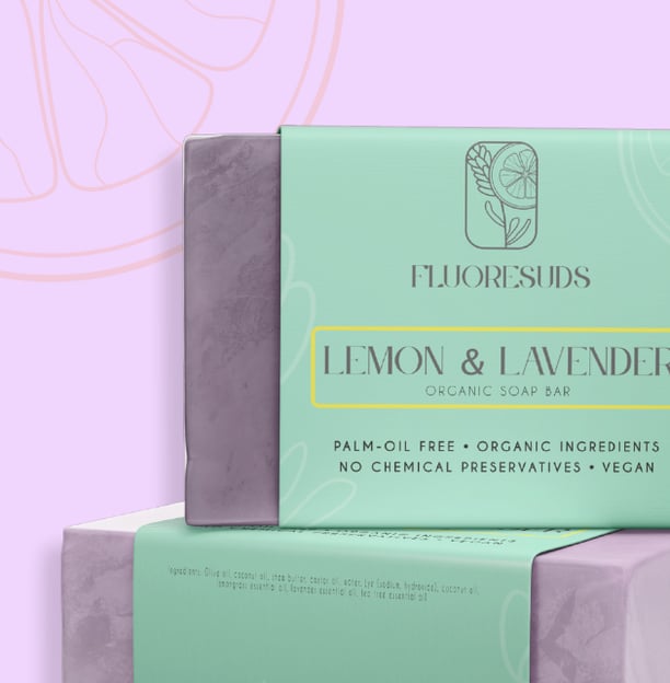
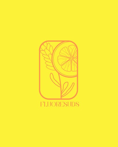
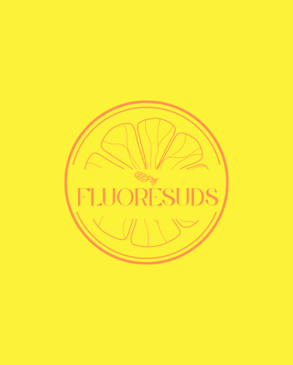
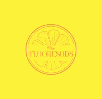
The brand mark for Fluoresuds is inspired by the natural ingredients that are at the heart of their soap-making process. We focused on lemon and lavender, the two key components of their flagship soap bar. The design incorporates elements that evoke these ingredients, creating a logo that is both fresh and grounded in nature. The lemon’s zest and the calming essence of lavender are visually represented, signaling the sensory experience our soaps offer.
To complement our vibrant yet natural color scheme, we selected a modern serif typeface for the primary brand font. This typeface includes custom elements that mimic the bubbly texture of soap suds, adding a playful and unique twist to the design. For the subline, we opted for a simple sans-serif typeface, ensuring clarity and readability while maintaining a clean, minimalist aesthetic.
The packaging for Fluoresuds is designed to reflect the brand’s commitment to natural, handcrafted quality while standing out on the shelves with its bright, inviting colors. Each soap bar is wrapped in packaging that highlights the main ingredients—lemon and lavender—through both imagery and color. The modern serif and simple sans-serif typography create a balanced and cohesive look, making the product instantly recognizable and appealing.